Moderators: lazyben, static14, texasvinyl
Peek-a-boo wrote:I got the book but it’s not signed as was advertised. I emailed Rough Trade and they said none were. They put in a lenticular book mark to compensate. Packaging is quite neat!I didn't get a tracking number, did you? Or did it just arrive?
Revolver_OcelScott wrote:It just arrived.Peek-a-boo wrote:I got the book but it’s not signed as was advertised. I emailed Rough Trade and they said none were. They put in a lenticular book mark to compensate. Packaging is quite neat!I didn't get a tracking number, did you? Or did it just arrive?
inksb wrote:I know about the DW original, what was the repress? It's one of my favorite Carpenter scores but I don't have it on vinyl yet.The original was in 2012 and the artwork was enclosed in a kind of a circle.

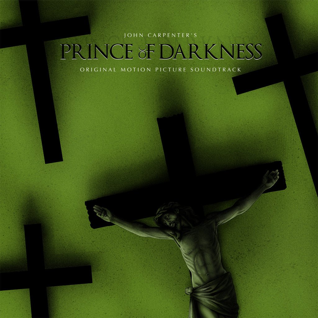
ScoJo wrote:Shadows aside.... this art treatment is a total wash for me I'm afraid. If someone can convincingly tell me what this image has (specifically) to do with the movie, I'll follow Herzog's lead and eat my shoe.The basement with the jar o’ devil juice is plastered wall to wall with crucifixes.
inksb wrote:Prince of Darkness this wednesday at the usual time on Mondo. I am not a fan of the artwork. The crosses don't do much for me, I don't like the font they used it looks like they were trying to pay homage with out actually using that font. It's not great. Now this may seem like a minor complaint but it's a very basic aspect of design that they seemed to have missed. The objects in the image have shadows, source of light is coming from the bottom left of the image, all of the shadows are larger on the top right side of each cross. The title text has a shadow too, except it goes to the top left. It was the first thing I noticed and it makes me feel like there is minimal proofing going on here on this release. I would have been that dick head creative director who drew big arrows digitally on the work and sent it back saying fix the shadows. lol.As a fellow creative director myself...100% on this whole post. I LOVE the wax treatment, but I'm less than thrilled with the sleeve design, and there is some strange lighting going on for sure. I didn't notice the shadows issue at first, but the font choice is really odd. its ALMOST his usual font, but not entirely. I'm a little confused about this pressing, is it the same as the previous? i might skip if thats the case, but if it is a new remaster then i'll pick up for sure.
inksb wrote:The objects in the image have shadows, source of light is coming from the bottom left of the image, all of the shadows are larger on the top right side of each cross. The title text has a shadow too, except it goes to the top left.Well, Satan is the Lord of Shadow, right? Maybe he's just that good, messing with your perception from another dimension.