Those are really great shaqfu! I like the not so much edge to edge feel ala WW's Rosemary's Baby than say Mondo's Pet Sematary or WW's F13II while the bottom version has a nice throwback feel - Why the ring wear? I think the way you have them set up...very nice presentation by the way...with the vinyl and the shadows leads to not needing it - Would love to see more of what you have done...as well as what others will come up with...excellent post and I hope it continues! - Bloody pool...how awesome!
Also liked the ring wear effect - adds 'authenticity'...
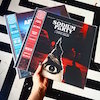
In fact much, much prefer these three mocked up It Follows covers to the 'Marmite' one Milan went for. Would buy that 'bloody pool' variant in a shot - but doubtless it would be limited to an impossible-to-buy 100
Who was the original artist for the bottom Ver 2 It Follows?
I'm seeing some effort and talent in those "squares" Phil - Let's say he's the guy doing layout...just like someone would be doing at any of the labels...and honestly I'm liking shaqfu's covers more than some of what were getting from the labels - Keep on keepin' on shaqfu!
I gotta agree, @HNC - while I'm really stoked that It Follows got a release,the official sleeve isn't great when put up against current output of other labels...different strokes n all that,but it seems quite a few people think the same, and I'm down with playing the 'what if' game. I might contrib a couple at some point
Cool custom sleeves yeah ! There's a couple of ost I got that have pretty beat covers and I'd been thinking of doing custom cover art for them. I should get to it and post them.
[quote=66919](...)while I’m really stoked that It Follows got a release,the official sleeve isn’t great when put up against current output of other labels…different strokes n all that (...) [/quote]
I actually like the It Follows LP sleeve art more than the CD/Digital cover art. Different strokes yeah
@Nathan - It's a crazy world, fo sho. It's great how there is mostly no real consensus on what makes a great genre OST sleeve. Keeps things innerestin'!
Here's a few of my own "variations" for Cold in July - have posted them before, but just wanna throw summat in to contrib somehow, I'll def have a crack at some others soon. Hmm, may tackle IT FOLLOWS actually....
Actually the more I look at it the more upset I am it's not real, very cool layout idea
I have been in this business a long time. Now if I don't want to do a show, it's not because I got stage fright. It's because some creature from beyond doesn't want me to do the show. Now gangway.
@NMA - using the plughole for the centre label is clever... and was about to suggest red splatter effect but then, of course - smacks head - the film is in black & white. Doubly clever.
Hey Mondo-DW / One Way Static / WaxWork / Lunaris / and others...got some talent here...how about a contest for an upcoming release for the STBC artists???